Friday 30 March 2012

WEEK 5

We finally got our own tutor, who I would call our mentor, Davor. I picked this group as Davor for one he is one of the best tutors I've had so far, also because of his interesting topic "Inter-cultural Communities". We spoke as a tutorial group about different cultures and their ways of life, we also looked at how Brisbane relates to the varying cultures and how it welcomes them. In separate groups however, we wrote down what came to mind when we thought of inter-culturalism and how these elements could be incorporated into HSW.
As a group, we decided to write down everything that came to mind when we thought of multi-culturalism, I have included a few below:
·         Architecture
·         Art/sculptures
·         Climate/environment
·         Health/wealth
·         Music
·         History
·         Tradition/culture
·         Religion/spirituality
·         Experiences
·         Clothing/Food
·         Technology
·         Age/colour/gender
·         Language/accent

Although these are very broad ideas and thoughts that came to mind, we decided to narrow it down to the key elements that would make one want to engage with the site, a place that welcomes every person of every background. We also looked at the types of spaces that can be multi-cultural in HSW such as:
·         Charity events/sponsors
·         Green areas/pathways
·         Recreational centres
·         Residential living
·         Art space/gallery/museum
·         Restaurants/cafes/bars
·         Water/river uses
·         Music & dance (performance)
·         Markets/shops
·         Sport activities
·         Space connector/transport

My interpretation of this concept is that no matter what culture you're from, you can always make a new place home as long as you add a piece of you to it to make it feel more 'at-home'. And instead of having a little of every culture all crammed up in one space, we might as well celebrate the different cultures and in doing so we must respect the land that gives us the freedom to do so - therefore celebrating that land too, which in this case is Howard Smith Wharves. I see this as a possibility for celebration, happiness and joy to people of all places without barriers or discomfort.

Wednesday 21 March 2012

WEEK 4

This week we worked on putting everything together on the posters and pretty'ing it up. Our Folie can be used by people of all ages, it respects the site and celebrates it. The materials reflect the site's history and present day structures, as well as the 5x5x5m boundaries being slightly in the river providing a different experience for users especially with high/low tide. The folie can be used all year round and any time, and even with massive forces will still stay in place - due to the nature of materials, ageing is not an issue either. Voids create beautiful textures where light and shadow are  also played with differently at different times of the day together. More information together with final drawings, diagrams and images can be found in the posters.

Techniques and programs used: Hand- drawings, tracing, Adobe PhotoShop, Ms Word, AutoCAD, Autodesk Revit, 3Ds Max and Adobe Illustrator
Posters to be added soon, as file seems too big at the moment

Sunday 18 March 2012

WEEK 3 - Part 2

Since we were taking the history of the site and its affect on the site with the materials and shapes used, we thought about other historical buildings that have contributed to HSW. One of the main places was the Customs house which can be seen from the site. We decided to implement it into the design therefore added a seat angled to face the user directly at the customs house, making it more obvious we decided that the seat should be rusted, hence the dome on the customs house.

We have removed more columns to give the user room to move around through the columns and to play with light/shadow throughout the day, lights are added on the ground beside a few columns for night use. Varying heights that relate to the buildings with thicker 600 x 600mm and 300 x 300mm seats for comfort and to take in the space around them. The metal, old and new timber textures were added for a more clear approach of the space. We have suggested hardwood - red ironbark as it will be used outdoors as columns and exposed to weathering.

Below is a simple Revit 3D drawing for a better understanding of the different key columns in 3 dimensional view, which I will render in 3Ds Max once everyone in the group is happy with it. I also added a few construction section and details explaining how they will be put together. I have contributed as well in the group's sectional drawing and notes, as well as the floor plan that I have drawn and annotated on AutoCAD which another group member then tadded colours over.

Hand drawn seat detail 
 Floor Plan drawn on AutoCAD and edited on PhotoShop

 Revit 3D drawing showing main structures

Wednesday 14 March 2012

WEEK 3

This week we looked at answering all the questions we had remaining from last week's meetings, which led to a simpler  Folie design and a whole new approach. Due to the assignment being due next week, this wasn't a great idea but a necessary one as a group of four designers with different approaches made it hard to come to a simple agreement. Anna, a group member, left the unit and course altogether, therefore we were left with three members as opposed to other group members of four, this however didn't slow us down.
We decided to change our approach and focus on the different levels in heights. That would relate back to the cliff face, but what the user would learn was not clear. We therefore decided to change the heights of the columns so that they relate to both the location and history of HSW, this meant taking into account everything that the site has to offer.

Image of my group playing around with pens to explain our ideas to one another

Image of sticks being placed randomly to play with heights, light/shadow, solid/void

After closely examining the site, we decided to duplicate the site plan of the city and HSW but interpret it in forms of columns. Middle (thick) columns form the bridge, and columns on either side reflect the buildings surrounding the bridge. In order for the user to understand this at a glance and be attracted to the space, we decided to change the materials of the columns for a clear understanding. The middle (bridge) columns are steel capped whereas the columns towards the city side are made of modern timber and are placed very close together whereas on the other side are old timber columns showing the historical buildings that existed and were used before the bridge was built, they however are placed further apart from one another.

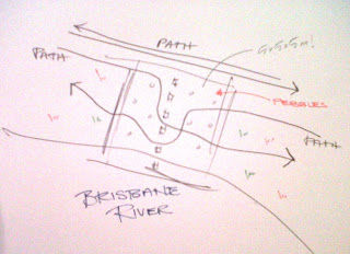
Last week I researched about learning and how one takes one step at a time in life, how our brain evolves and we grow with time and experiences if put in simple. We decided that our space could have the same concept, we therefore placed it close to the water so that the first few columns come out of the water and the rest are on land. This followed the concept of learning and growing and the water acts as a starting point. The reflexology paths looked at last week were also implemented in the design, however pebbles were used instead for a more user-friendly approach.

Image of a drawing I made to explain paths through and around the Folie

Saturday 10 March 2012

WEEK 2

This week we were asked to form into groups of four members to design a Folie together at the Howard Smith Wharves. Two members of my group however were missing, therefore we joined a group which had the same issue, and ended up with four members again. This however took a lot of time, valuable time, but we knew we could catch up easily.
The Folie:
It is a design of a learning space within the site, which should fit within a 5mx5mx5m box where a user could learn from the space. What they learnt or how they learnt was up to the designer. So the group researched into the meaning of learning, the different ways of learning/teaching, and examples of other public spaces that used the same approach.

Learning:
Put in simple - Learning a lot of the time is defined by a change in behavior, which can be shown by executing knowledge, skills and education practices. When a newfound information is available to one and they incorporate it into their lives, they are/have learning/learnt.
UMSL. (2012). Destination 2: What Is Learning?. Available: http://www.umsl.edu/technology/frc/DEID/destination2adultlearning/2blearning.html. Last accessed 7th March 2012.
Folie Inspirations:
We looked at different examples for inspirations as per below, and came to an agreement that we wanted our user to interact with the space ie. use their own bodies to learn by touching and feeling. We want the user to have an experience they would never forget, even after years to come, nothing too dramatic but instead something that would inspire, amaze and challenge people of all ages and backgrounds.

1. This inspired the motion of steps, how one learns taking baby steps and moves higher as they grow older and learn more based on life experiences and the steps keep going (never-ending).

2. This inspired the motion of opening up petals and allowing light in, one could use the space however they like and play with light/shadow, and leave a piece of them behind for the next user of the space.


3. Again, using one's own creativeness/experience, the user can move objects from one space to the other to form a pattern with a message or randomise the pattern for their own comfort. A flexible space/wall that one could relate to.


Source: http://learningmaterialswork.com/blog/tag/mini-art-installation/


4. A group member spoke about her experience overseas where she went mountain climbing, the instructor asked them to walk on these random rocks bare feet before the climb. She was confused yet amused by it that she had to research about it before she got home, it was actually a reflexology path - a path the Chinese have used millions of years ago to benefit the health through massaging the feet. We decided this too would be a great contribution to the design.

 Source: http://www.dreamstime.com/stock-photo-foot-reflexology-pebble-path-image618120

5. Finally, the idea we liked most, well at least I was most excited with - is the motion of push and pull. Where a space can have for example squares that can be pulled out at different levels, some still and some longer than others. This suits the site where it reflects the cliff face, except its inspired by it for users to pull and push cubes in and out to make seats, table, steps. One can learn at different ages and heights, how they can change a space to suit their needs.


Source: http://www.concerningtime.org/

The tutors however, allowed us to think of the complexity of the design especially with the time and space constraints that would make our design very complex for the reasons given. We therefore decided to simplify it, how? we aren't sure yet.

Possible techniques and materials to achieve our Folie design are:

·         Referring back to the cliff face and how this could be abstracted into a form

·         Timber as a material to reference the history of the wharves and the site.

·         Voids and solids reflecting the cliff face transformed into openings and movable elements.


Problems and issues that were still unresolved by end of the week:

·         How are the users going to learn? will it satisfy intuition?

·         What are we teaching? direction/history/location?

·         Access to the site

·         How to attract the users to stop and engage with the space

·         Geography - floods

·         Where can the structure be viewed from?

·         Target users

·         Change of use - seasons, day/night

Sunday 4 March 2012

WEEK 1

Welcome to my blog! I will be sharing with you all the design work I am working on, from initial stages (bubbles, inspirations, diagrams and sketches) until the final proposal stage (plans, renders, sections and details). I will be looking at the Howard Smith Wharves site in Brisbane, Australia.

Howard Smith Wharves:
The site was originally built as the Brisbane Central Wharves in early 1930's, however in mid 1930's it was leased by a shipping company called Howard Smith and Co and soon after was known as the Howard Smith Wharves. It was used for shipping until the 1960's when Howard Smith and Co. moved downstream to different facilities. The site however is important economically and culturally and shows the history of Brisbane and the expansion of the city. (1)

I walked through the QUT botanical gardens and along the river edge to get to HSW, and took pictures of the site from afar and as I got closer, however due to fencing I could not get into the site which was a shame as I would have loved to be under the bridge and get a sense of the noise, breezes and views the site has to offer.


Relevant pics will be added to the poster with further notesThere will be three different assessment pieces, and weekly uploads to update you on what goes on in the mind of a third year Architecture student at QUT. Any feedback is acceptable, so feel free to suggest or comment on anything you want.


References:
1. Brisbane City Council. (2010). Site History. Available: http://www.brisbane.qld.gov.au/planning-building/current-planning-projects/urban-design-projects/howard-smith-wharves/site-history/index.htm. Last accessed 2nd March 2012.