Tuesday 19 June 2012

Final

A few of the final renders and so on together with a few pictures of the model I have been working on at home that I didnt get the chance to bring to uni as it was not complete. It was an enjoyable semester, and I loved my theme! This was a great experience that forced one to think of how they would interpret a place and come up with their own brief for the proposal of Howard Smith Wharves. I wish I had more time to work on computer programs to make my renders and views better, however, overall it was a great experience and I definately learnt more than words could say from Davor as my mentor. Final renders and so on will be uploaded after the presentation. Cant wait to go back home and see my family after 2 years! Happy Holidays :)

Cut through path to stage (Revit)

Structural components of Stage roof

3d view of curved roof over BBQ/Stalls area

3d view of Ferry Terminal (Sketchup)

3d view of design proposal (Rhino)

Circulation through site

Day View

Night View

Master Plan

All these drawings are not finished, most of them still need annotations or so. Please see the next and final post for poster and presentation files. Thanks :)

Friday 15 June 2012

Trees + Materials

After playing around with the location of trees which I strategically placed to:
  • Prevent/re-direct unwanted winds
  • Sun penetration, shading to certain areas
  • Providing privacy for spaces
  • Difference in heights and width
  • Blockage of certain views from certain points, influencing one to explore

Sketch of breeze through a tree

Image of shaded site/roof plan with stalls

I realised that my design still lacks that directional paths, that would influence one to enter different parts of the site and have a journey through it. It's not so obvious in a way that I would prefer. Why would a user come off the terminal and walk all the way up to my stage instead of follow the main bike/ped. path to their intended location? How can I attract people to explore the different beauties on the site that has taken me a fair bit of time to accomplish?

It is then, after more research and concentration and focus into these numerous garden designs and pathways that I realised, I do not need a grand sign or directly fixed paths forcing one to be directed. The use of materials, colours and textures really benefit my design, and that is why I decided to change the main path leading into the stage's materials. I decided to put a 'red carpet' as Davor called it, leading one into the stage area represented however through timber. Whereas other paths are of polished/rough concrete. Due to wanting to design a disable-friendly site, my choice of sizes and textures where very important. I also decided to break one of the paths into pads, and also the seating areas don't have to be divided through walls, that's why I eliminated walls in the first place, I wanted to prove that you can divide and bind a space through the use of materials/textures, light/shadow etc.

Wednesday 13 June 2012

Design of Stalls

As I mentioned in the previous post, the design of the stalls needs to allow them to be folded and kept in storage when not in use, therefore designing/purchasing stalls that are flexible and space-saving, however still structurally capable to cater for external forces that could act on them.

This led me to do further research into the design of my stalls. How big should they be? What materials should they be made of? How user-friendly should they be for users? How strong do they need to be?
Below are a few examples of the stalls that I was most interested in, together with my decisions for simple stalls that would cater to their needs.


Monday 11 June 2012

Amenities

A area as such needs a space for amenities, such as public rest rooms and storage. I had originally placed a box to cater for these spaces, however, I never actually designed these spaces, will they even fit into that box? I therefore started looking more into it. How many restrooms would I need? Do I provide a disabled one as well? How big does the storage space need to be and what would it store?

Due to a lot of curvature and "flowy" spaces already on the proposed site, I decided to keep this space simple (also for financial reasons), it isn't anything grand however would need to function and be aesthetically pleasing due to it's approximation to the Grand stage. I needed to know what exactly I wanted this space to represent or include before I could design something, otherwise, I would end up with a box AGAIN, and try to force it into the design.

I took a closer look at how one would access this space, would they need to go around the back? Is there one main entrance with seperate entries for different genders? Does the cliffe even matter here?


After drawing up bubble diagrams and sketches on how I want this space to work, I ended up with the following design. Although it is used for amenities, I still want the users to experience being within the cliffe - if not touch it! I therefore decided that instead of it sticking out infront of the cliffe, why not make it comiflage? I dug into the cliffe, not too much, inserted the shapes I wanted, and used materials on the exterior to match the building with the cliffe.
Since the storage space will only cater for gardening tools as well as stalls that can be folded back, the space is designed to cater for that and the occassional dress-up of performance personels. This space can only be accessed once keys are retrieved from council, therefore excluding general public. And due to its approximation to the stage, I decided to leave my back-stage access, where one can change or relax before getting up on stage for their performance, this way being hidden within the cliffe. (no back service to be seen). Which is also why I decided to hide the storage doors from being seen when at the stage area (not very aesthetically pleasing, and doesn't have to be). My design for this proposed area is as shown below.

Thursday 7 June 2012

Back to Curves + Roof Design

After working on the previous design for a while now, I ended up reaching a dead end. I focused on so many different angular shapes, materials, structures, angles and heights. However, it was hard to blend that concept with my ferry terminal and bridge, nomatter what I tried to do with these two structures, no angular shape seemed worthy of changing the original design I had for them.

And unfortunately, I decided to go back to my curved structures. I miss the smooth and friendly curves, how easy they were on the eye and how they made me happy inside which I know they would make their users in real life. They weren't intimidating, they didn't cause one to stare, and as much as I wanted that, I don't think it is the approach my design needs, as much as I tried to force it to work, I kept seeing myself returning to the original design I had and trying to mimic it in a way. However, all hope is not gone, and all time is not wasted, we learn from our mistakes and it's time that I realised that my original way is the way I actually want it to be. This was an experiment which obviously disappointed me, and I'm gladly going back to the original!

However, not completely the original!

I had to venture through different programs trying to achieve the design I wanted, including AutoCad 3d, Revit, Rhino, Sketchup & Archicad. You will notice with a lot of my posts that they will be from numerous programs because of now, each one lacks a certain aspect that I need so I cant make up my mind in which one to stick with! :(

Through using the angular roofs, it made me realise that such long structures don't suit to act as one, but instead as their own structures in their own rights. Thats why I decided to change the long roof structure spanning a large distance, into segmented roofs which still connect evidently through their connection to the ground and the angles that they come back out of the ground from.

3d view of roof diappearing into the ground and back up again (Rhinoserous)


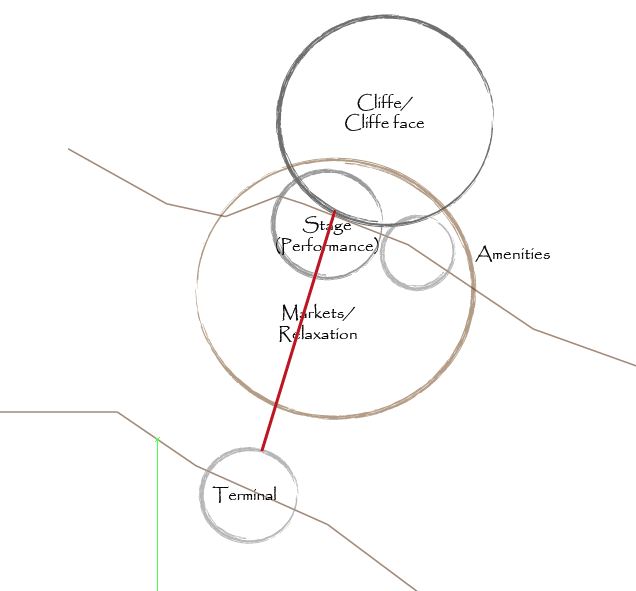
I also looked at the mushroom/umbrella roof I have and did some more research into it. A few examples are shown below, where I finally came to the design I'm satisfied with. Below are examples, sketches and drawings of the proposed stage roof.

Umbrella model and subdivisions
http://www.sciencedirect.com/science/article/pii/S0010448510002460

House of the risings suns - Metricon Stadium roof system
http://designbuildsource.com.au/house-rising-suns-metricon-stadium

Rosa Parks Transit Center roof system
http://criticaldetroit.org/buildings/rosa-parks-transit-center/

The main inspiration I got with the roofs above, is that they are there to leave an impression as one, serve a shading purpose, give a light feeling instead of large mass, and give the space a  more organic atmosphere instead of the modern cube. Below is my interpretation of these within my space.

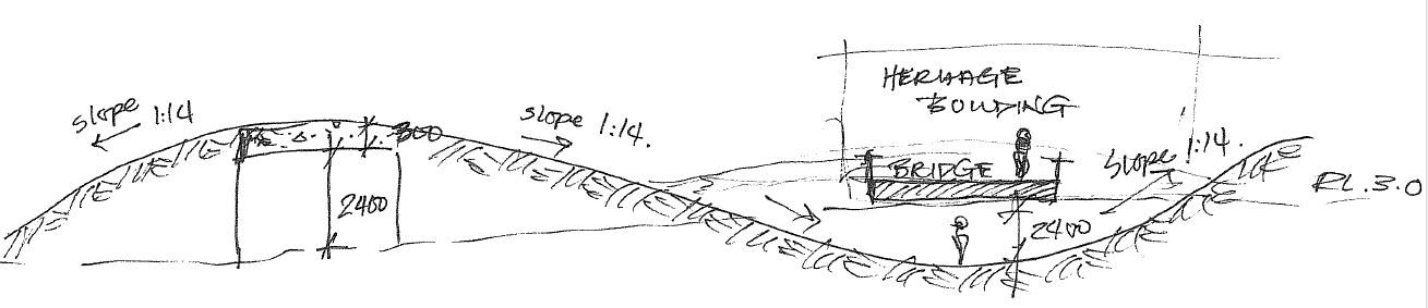
Simple section through stage & roof and ped/bike path


Roof Elevation

Section AA

Looking through section AA


Saturday 2 June 2012

Angular Roofs

After taking a break from my design to focus on other assignments due, once coming back to it again with fresh eyes and a clear head. I realised that I have a lot of curves on my page, which in a way made me decide to have a different approach by breaking this geometry and instead creating angular and sharp objects to bring out the difference in elements and structures.

I decided to change all the roofs into sharp angular roofs for a more varrying design, so that it looks more contemporary, more demanding for attention in a way. I still kept the idea of 'coming out of the ground' however, it became 'coming out of the ground sharply'. These are the new sketches and drawings that I have produced to cater for these changes, which have now been taken into digital drawings.


Tuesday 29 May 2012

Terminal Design

The ferry terminal is an important feature in my design, which is why I decided not to have just any design that caters for a terminal, but one that blends in as well as promotes the structures already existing on the site as well as materials used. Obviously, the water level (tide) changes with time, therefore I had to design a terminal that caters for these changes as well as looks aesthetically pleasing.
Proposed Terminal in Sectional view

Proposed terminal in Plan

I researched into some designs, codes and specifications and finally came up with my solution after taking into consideration all the different factors from similar approaches. Below are a few of the examples I have looked at and my idea of what my terminal will look like. I still kept with the idea of curved roofs coming out of the ground and how one will experience this as soon as they stop by the site.


The use of a lookout space allows users to appreciate and celebrate the Brisbane river, Story Bridge and the site itself. It provides more than just an ordinary stop, instead opens one to a different experience.

Wednesday 23 May 2012

Seating Spaces + Drainage

Due to the fact that I am proposing that this site be a relaxing area, a place for one to unwind from the busy city life, I want one to have the complete freedom and comfort to feel at home away from home. Therefore not restricting one to conform to certain regulations (paths, seating, views) but instead have a completely free mind frame allowing them to access and use the site in whatever way they feel comfortable.

That is why I am proposing different heights (achieved through contours) so that one can sit, sleep, relax and read a book on any position at any location. The use of grassy fields instead of fixed structures allows one to do so in comfort, therefore as shown below, you can see that any space can be used for relaxation/play according to one's liking. Views of the cliffe, Brisbane river and Story bridge have not been blocked in any way.

Example of intended and non-intended seating, comfort/freedom


However, I have noticed that there could be a lot of water retention after heavy rains in Brisbane that could lead to minor flooding on my site, which can make the area hard to use in some seasons. Thats why I decided to go back and make sure that all overland water flow directly back to the river, otherwise need to be catered for by drainage back to the river. Below are images/sketches of locations that I think would need some sort of assistance in the reduction of ponding that could occur after heavy rain periods. Some examples include the main stage, the under-bridge path, and the tunnel-like structure. This will also later on have an impact on the stage itself and how the roof will cater for these issues will be discussed in future posts.


Saturday 19 May 2012

Change of Countours 2

I realised that changing the contours especially for the main bike/pedestrian path that runs across my site, meant that it blocked access to the stage except from either sides of the stage. I however want the users to see and be able to access the stage directly from the bike/ped path as well as the ferry terminal or any other spot in the area easily and more so - directly. This lead me to designing a tunnel-like feature allowing users to access the stage under the bike/ped. path directly to the stage area. This also meant that careful use of heights is very important to keep in mind, and to name a few that I worked with such as:
  • min. 2400mm ceiling height (usually habitable areas) but complies to my idea
  • 1:14 min gradient of ramp (bike path up and back down)

To keep the path from the terminal to the stage more uniform and directional, I decided to have minimal changes using contours with this path, that way directly leading one to the stage area, however I have looked at other areas that can be transformed for a more experiental journey.

Due to the fact that the main bike/ped. path had a downward motion (contours) infront of the heritage listed building shown below, I still did not want to lose the relevance and importance of this building on HSW therefore added a bridge above the path leading directly to the building. That way, when this building one day gets renovated (hopefully for art purposes as the design of the HSW currently is proposed to be) it would have a direct path leading to it showing it's important and elegance on the proposed site.


I STILL was not satisfied with the contours by this point therefore played around with them some more until I came up with a satisfying idea. Adding a little hill-like structure, on one side of the site meant that:
  • Children can play/roll on the grassy hill
  • During functions/celebrations, one can sit on it and still view performances on the stage
  • The hill can be used for numerous ideas such as art works etc limited to your imagination
I therefore placed it strategically on the site focusing on angles and heights, that will allow the user (if they wanted) with the angle of it's location in comparison to that of the stage to still be able to view performances without the need to be right in the centre of it, careful choice of heights so that the contours (bike path) do not block any views.

3d sketch of introduced hill (left) and direct view to stage from afar

Another use for hill - arts

Tuesday 15 May 2012

Change of contours 1

Looking further into other designs of outdoor green spaces and gardens, I realised that the most successful ones (atleast in my eyes) were designs that were not flat in landscape. Although I am not a landscape student neither are my knowledge in landscaping any better than any average design student I know, especially coming from a Middle-Eastern background (desert). I looked at my own background, the use of contours to achieve a more aesthetically appealing and interesting journey for visitors.

My first inspiration was from where I originally am from, the use of sand dunes. Their subtle contours and changes in heights drew me to changing my design by giving it more character and a more enjoyable experience for its users.

Sand dune inspired contours, playing with heights

Other examples are also shown below, with their careful use of contours to design spaces without the need of paths or leaders, the contours and ground changes led one to the designated paths without the need for indicators. In a way, it led to unlimited paths.


I decided to play with my contours and decide what the best approach would be after looking at a fair few examples (only most relevant posted here). The main pedestrian/bike path was a very boring path through the site, there was no need for the rider to stop and have a look at their surrounding which is why I focused on this path first and foremost. Since I didn't have it clear enough.

Current floor plan design, bike/ped. path shaded


I therefore wanted to give these users an experience of being within the greenery instead of just passing through it, which was introduced by careful manipulation of contours without the need of disturbing the ground too much (giving it a more natural feeling) so that when one access through the site and out again, they will take something with them. What? Change in scale and height.

Because the grand stage is an important feature in my design, I wanted all users to know of it's existance and see or access it one way or another, it needs more of an attraction rather than just a grand roof disappearing within the cliffe. This is where I combined the two, the bike path must access the stage without the need to actually go through it, thats why I decided to raise the path so that the main bike/pedestrian path are at the same level as highest seating level of the stage audience, allowing the path users to stop and interact with the space as well as have a different view across their journey.


That wasnt just the change in the main path, I also decided to let the path/contours decrease close to the heritage listed building on the right of my site, for these users to feel a change of scale. I could imagine paddling along and next thing you know I'm going downwards and next thing you know I'm paddling harder to get back up the path and passing through a stage with a beautiful roof above me and back down again to the level I originally was on before I entered this outdoor garden site.


This not only allows the user to see the stage, but on occassions where functions/celebrations are happening, one will have no choice but to interact or slow down (as lots of people will be accessing these routes) and in a way be part of the celebration that's taking place. Therefore influences users to stop and take part within the area, however, even if they decided not to, they will still take away with them the smells, colours and sounds going along these paths.

Friday 11 May 2012

Terminal Location

Due to the location of my specific site on HSW, I decided to include a ferry/city cat terminal for numerous reasons:
  • Easier access to the proposed site
  • Continuation of old path along the river (river view)
  • Promotion of HSW in general
  • Stop for residents around HSW, therefore using the new terminal for work, leisure, education etc (meaning they have to pass by/through my site in order to get there, that way promoting itself and it's beauty

Convinience of ferry location within city

Convinience of ferry location within site

This however, made me decide to change the original layout I had of the breakout/waiting area infront of the terminal. Instead of views directly to the terminal, I divided this space into 2 areas on either side of the path connecting the terminal from the river to land. This allows for views of the river and the Story Bridge, as well as allowing visitors coming from the terminal to view the grand stage in the background instead of a stopping area ahead of them.

Sketch indicating views from breakout/waiting areas

Sunday 6 May 2012

Layout + Movement

After receiving feedback from the minimal design I could actually display, due to the corruption of my file. I knew that I have to make the next one a more in-depth presentation as well as drawing techniques to send my message across. I looked into the organisation of my spaces and how I could explain the layout that I had come up with.

Simply put, the floor plan consists of divided areas of Relaxation/BBQ/stalls. Why? Because a linear (one) large space is boring as well as uncreative in terms of division in use, greenery, aesthetics, movement and excitement of journey. Below are images and sketches clarifying this.


Main location of spaces
Connection from terminal to stage (cliffes)

Linear vs. Scattered


I also thought about how the vehicles are going to access my site in order to deliver goods to their stalls, this can damage my grassy fields if not catered for. Therefore decided that vehicles can access (only stall members with approval) until the heritage listed buildings located underneath the story bridge, and not past that point. Therefore providing ease of transfer of goods and decorations to the stalls and back again once they're done.