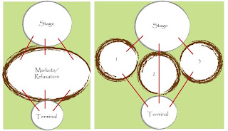
Simply put, the floor plan consists of divided areas of Relaxation/BBQ/stalls. Why? Because a linear (one) large space is boring as well as uncreative in terms of division in use, greenery, aesthetics, movement and excitement of journey. Below are images and sketches clarifying this.
Main location of spaces
Connection from terminal to stage (cliffes)
Linear vs. Scattered
I also thought about how the vehicles are going to access my site in order to deliver goods to their stalls, this can damage my grassy fields if not catered for. Therefore decided that vehicles can access (only stall members with approval) until the heritage listed buildings located underneath the story bridge, and not past that point. Therefore providing ease of transfer of goods and decorations to the stalls and back again once they're done.


No comments:
Post a Comment