We
decided to change our approach and focus on the different levels in heights.
That would relate back to the cliff face, but what the user would learn was not
clear. We therefore decided to change the heights of the columns so that they
relate to both the location and history of HSW, this meant taking into account
everything that the site has to offer.
Image of my group playing around with pens to
explain our ideas to one another
Image
of sticks being placed randomly to play with heights, light/shadow, solid/void
After
closely examining the site, we decided to duplicate the site plan of the city
and HSW but interpret it in forms of columns. Middle (thick) columns form the
bridge, and columns on either side reflect the buildings surrounding the
bridge. In order for the user to understand this at a glance and be attracted
to the space, we decided to change the materials of the columns for a clear
understanding. The middle (bridge) columns are steel capped whereas the columns
towards the city side are made of modern timber and are placed very close
together whereas on the other side are old timber columns showing the
historical buildings that existed and were used before the bridge was built,
they however are placed further apart from one another.
Last
week I researched about learning and how one takes one step at a time in life,
how our brain evolves and we grow with time and experiences if put in simple.
We decided that our space could have the same concept, we therefore placed it
close to the water so that the first few columns come out of the water and the
rest are on land. This followed the concept of learning and growing and the
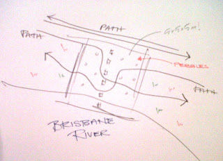
water acts as a starting point. The reflexology paths looked at last week were
also implemented in the design, however pebbles were used instead for a more
user-friendly approach.
Image of a drawing I made to explain paths through and around the Folie


No comments:
Post a Comment