Tuesday, 29 May 2012

Terminal Design

The ferry terminal is an important feature in my design, which is why I decided not to have just any design that caters for a terminal, but one that blends in as well as promotes the structures already existing on the site as well as materials used. Obviously, the water level (tide) changes with time, therefore I had to design a terminal that caters for these changes as well as looks aesthetically pleasing.
Proposed Terminal in Sectional view

Proposed terminal in Plan

I researched into some designs, codes and specifications and finally came up with my solution after taking into consideration all the different factors from similar approaches. Below are a few of the examples I have looked at and my idea of what my terminal will look like. I still kept with the idea of curved roofs coming out of the ground and how one will experience this as soon as they stop by the site.


The use of a lookout space allows users to appreciate and celebrate the Brisbane river, Story Bridge and the site itself. It provides more than just an ordinary stop, instead opens one to a different experience.

Wednesday, 23 May 2012

Seating Spaces + Drainage

Due to the fact that I am proposing that this site be a relaxing area, a place for one to unwind from the busy city life, I want one to have the complete freedom and comfort to feel at home away from home. Therefore not restricting one to conform to certain regulations (paths, seating, views) but instead have a completely free mind frame allowing them to access and use the site in whatever way they feel comfortable.

That is why I am proposing different heights (achieved through contours) so that one can sit, sleep, relax and read a book on any position at any location. The use of grassy fields instead of fixed structures allows one to do so in comfort, therefore as shown below, you can see that any space can be used for relaxation/play according to one's liking. Views of the cliffe, Brisbane river and Story bridge have not been blocked in any way.

Example of intended and non-intended seating, comfort/freedom


However, I have noticed that there could be a lot of water retention after heavy rains in Brisbane that could lead to minor flooding on my site, which can make the area hard to use in some seasons. Thats why I decided to go back and make sure that all overland water flow directly back to the river, otherwise need to be catered for by drainage back to the river. Below are images/sketches of locations that I think would need some sort of assistance in the reduction of ponding that could occur after heavy rain periods. Some examples include the main stage, the under-bridge path, and the tunnel-like structure. This will also later on have an impact on the stage itself and how the roof will cater for these issues will be discussed in future posts.


Saturday, 19 May 2012

Change of Countours 2

I realised that changing the contours especially for the main bike/pedestrian path that runs across my site, meant that it blocked access to the stage except from either sides of the stage. I however want the users to see and be able to access the stage directly from the bike/ped path as well as the ferry terminal or any other spot in the area easily and more so - directly. This lead me to designing a tunnel-like feature allowing users to access the stage under the bike/ped. path directly to the stage area. This also meant that careful use of heights is very important to keep in mind, and to name a few that I worked with such as:
  • min. 2400mm ceiling height (usually habitable areas) but complies to my idea
  • 1:14 min gradient of ramp (bike path up and back down)

To keep the path from the terminal to the stage more uniform and directional, I decided to have minimal changes using contours with this path, that way directly leading one to the stage area, however I have looked at other areas that can be transformed for a more experiental journey.

Due to the fact that the main bike/ped. path had a downward motion (contours) infront of the heritage listed building shown below, I still did not want to lose the relevance and importance of this building on HSW therefore added a bridge above the path leading directly to the building. That way, when this building one day gets renovated (hopefully for art purposes as the design of the HSW currently is proposed to be) it would have a direct path leading to it showing it's important and elegance on the proposed site.


I STILL was not satisfied with the contours by this point therefore played around with them some more until I came up with a satisfying idea. Adding a little hill-like structure, on one side of the site meant that:
  • Children can play/roll on the grassy hill
  • During functions/celebrations, one can sit on it and still view performances on the stage
  • The hill can be used for numerous ideas such as art works etc limited to your imagination
I therefore placed it strategically on the site focusing on angles and heights, that will allow the user (if they wanted) with the angle of it's location in comparison to that of the stage to still be able to view performances without the need to be right in the centre of it, careful choice of heights so that the contours (bike path) do not block any views.

3d sketch of introduced hill (left) and direct view to stage from afar

Another use for hill - arts

Tuesday, 15 May 2012

Change of contours 1

Looking further into other designs of outdoor green spaces and gardens, I realised that the most successful ones (atleast in my eyes) were designs that were not flat in landscape. Although I am not a landscape student neither are my knowledge in landscaping any better than any average design student I know, especially coming from a Middle-Eastern background (desert). I looked at my own background, the use of contours to achieve a more aesthetically appealing and interesting journey for visitors.

My first inspiration was from where I originally am from, the use of sand dunes. Their subtle contours and changes in heights drew me to changing my design by giving it more character and a more enjoyable experience for its users.

Sand dune inspired contours, playing with heights

Other examples are also shown below, with their careful use of contours to design spaces without the need of paths or leaders, the contours and ground changes led one to the designated paths without the need for indicators. In a way, it led to unlimited paths.


I decided to play with my contours and decide what the best approach would be after looking at a fair few examples (only most relevant posted here). The main pedestrian/bike path was a very boring path through the site, there was no need for the rider to stop and have a look at their surrounding which is why I focused on this path first and foremost. Since I didn't have it clear enough.

Current floor plan design, bike/ped. path shaded


I therefore wanted to give these users an experience of being within the greenery instead of just passing through it, which was introduced by careful manipulation of contours without the need of disturbing the ground too much (giving it a more natural feeling) so that when one access through the site and out again, they will take something with them. What? Change in scale and height.

Because the grand stage is an important feature in my design, I wanted all users to know of it's existance and see or access it one way or another, it needs more of an attraction rather than just a grand roof disappearing within the cliffe. This is where I combined the two, the bike path must access the stage without the need to actually go through it, thats why I decided to raise the path so that the main bike/pedestrian path are at the same level as highest seating level of the stage audience, allowing the path users to stop and interact with the space as well as have a different view across their journey.


That wasnt just the change in the main path, I also decided to let the path/contours decrease close to the heritage listed building on the right of my site, for these users to feel a change of scale. I could imagine paddling along and next thing you know I'm going downwards and next thing you know I'm paddling harder to get back up the path and passing through a stage with a beautiful roof above me and back down again to the level I originally was on before I entered this outdoor garden site.


This not only allows the user to see the stage, but on occassions where functions/celebrations are happening, one will have no choice but to interact or slow down (as lots of people will be accessing these routes) and in a way be part of the celebration that's taking place. Therefore influences users to stop and take part within the area, however, even if they decided not to, they will still take away with them the smells, colours and sounds going along these paths.

Friday, 11 May 2012

Terminal Location

Due to the location of my specific site on HSW, I decided to include a ferry/city cat terminal for numerous reasons:
  • Easier access to the proposed site
  • Continuation of old path along the river (river view)
  • Promotion of HSW in general
  • Stop for residents around HSW, therefore using the new terminal for work, leisure, education etc (meaning they have to pass by/through my site in order to get there, that way promoting itself and it's beauty

Convinience of ferry location within city

Convinience of ferry location within site

This however, made me decide to change the original layout I had of the breakout/waiting area infront of the terminal. Instead of views directly to the terminal, I divided this space into 2 areas on either side of the path connecting the terminal from the river to land. This allows for views of the river and the Story Bridge, as well as allowing visitors coming from the terminal to view the grand stage in the background instead of a stopping area ahead of them.

Sketch indicating views from breakout/waiting areas

Sunday, 6 May 2012

Layout + Movement

After receiving feedback from the minimal design I could actually display, due to the corruption of my file. I knew that I have to make the next one a more in-depth presentation as well as drawing techniques to send my message across. I looked into the organisation of my spaces and how I could explain the layout that I had come up with.

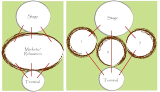
Simply put, the floor plan consists of divided areas of Relaxation/BBQ/stalls. Why? Because a linear (one) large space is boring as well as uncreative in terms of division in use, greenery, aesthetics, movement and excitement of journey. Below are images and sketches clarifying this.


Main location of spaces
Connection from terminal to stage (cliffes)

Linear vs. Scattered


I also thought about how the vehicles are going to access my site in order to deliver goods to their stalls, this can damage my grassy fields if not catered for. Therefore decided that vehicles can access (only stall members with approval) until the heritage listed buildings located underneath the story bridge, and not past that point. Therefore providing ease of transfer of goods and decorations to the stalls and back again once they're done.

Wednesday, 2 May 2012

WEEK 9 - Part 2

Today.... was basically a devastating day.. I went happily ready to present my work so far, had a class from 1 - 4 this afternoon and presented which all went great, then before going to the design lecture I decided to upload my powerpoint on blackboard, however the file was corrupted, yes, corrupted. I was running out of time, there was no way I would be able to run home and get another copy and run back to uni again within half an hour, I decided to upload any of my unfinished work which were present on the uni computers to a powerpoint and hand something in, something, anything had to be given in! I didnt get the chance to get work off my blog as I was under so much stress and disappointment. My presentation didnt go well either, but with the kindness of Davor he decided he will mark my blog instead and hopefully (fingers crossed) it will all go well. I will however re-arrange the work I have already and produce a new powerpoint, even if it wont get marked. The group work for project one didnt go well either, as no one wanted to agree on a design (with the amount of time we were given to resolve it, we couldnt afford arguing) and basically none of us were satisfied with the final project, and I really need to get my game up for the next one. Once again, fingers crossed. Good night :(